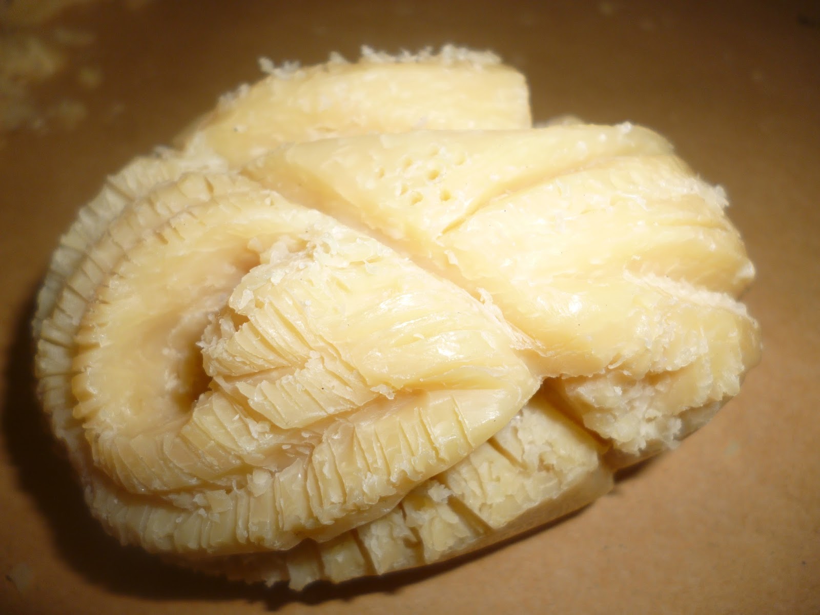
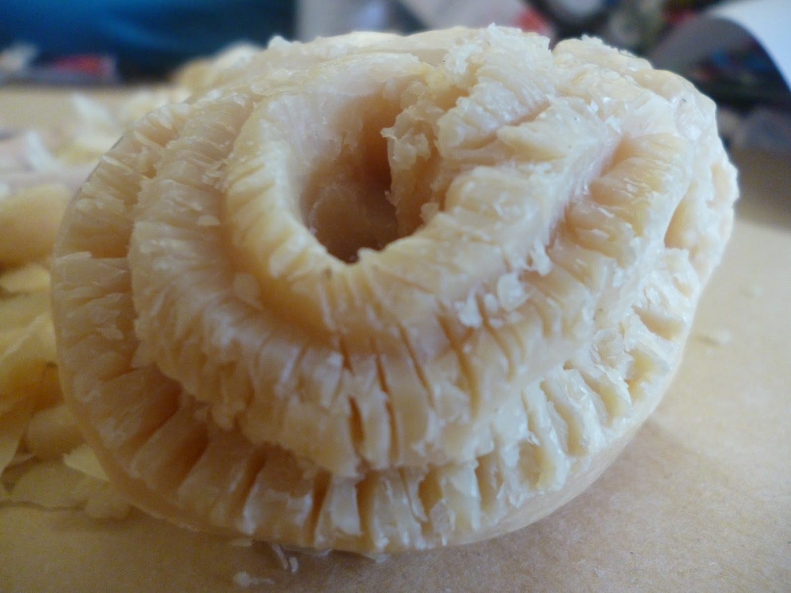
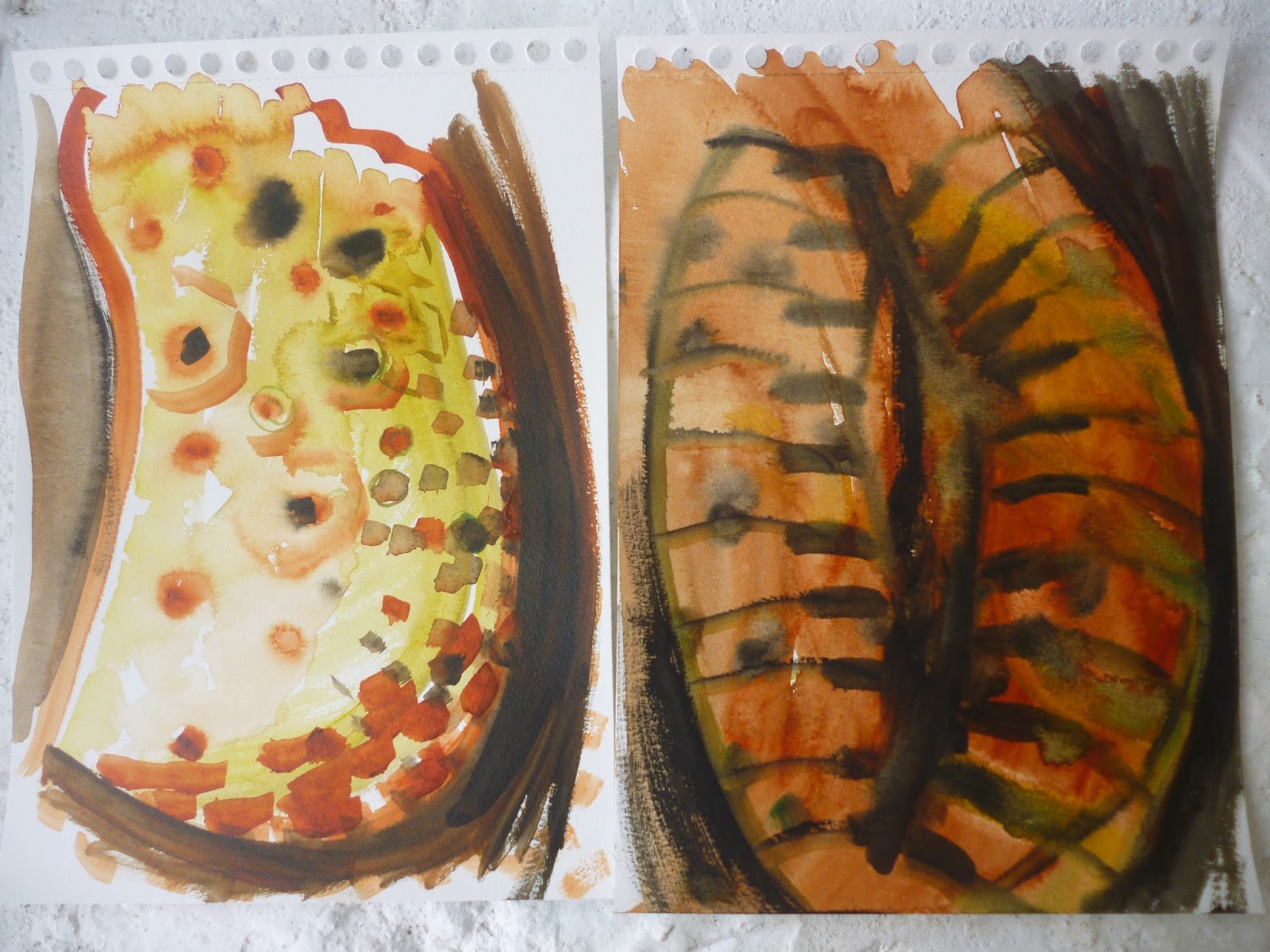
Shell paintings by Amiria Robinson Gale: "It is the broken, worn, incomplete shells that provide inspiration. This one has little pock marks in the surface where bugs have gnawed at it and faded brown lines that dash across the surface. The composition sketch in black pen has scribbled notes reminding me what the work was about. It is not overly detailed, but depicts the structure of the work; the placement of the shell; the landscape within and the main water lines extending out from the curves of the shell. Note that the representation of the shell is not entirely realistic, but has been slightly simplified / stylised. The shell in this painting has been built up with a very thick layer of modelling compound – at its deepest, this protrudes 20mm out from the painting board. The lower stripy section of shell is covered with bumpy, textured handmade paper. A layer of gesso has primed the work before painting with Atelier acrylic. The water has been painted using many translucent layers, with gel medium and Atelier artist acrylic paint. The finished work is 1000 x 1000mm and depicts a semi-abstract shell tumbling within the ocean, with a landscape shown through the shell. It was completed in 2004. This is probably my most well known work. The painting was sold privately and now hangs in a private collection in Australia."
 http://www.amiriarobinson.com/beach-paintings/
Sara Jane Doberstein: Inspired by the beauty of coastal areas, she entices us with realistic paintings of seashells and other seashore phenomena. Vivid color and a refined sense of light contribute to the amazing sense of wet shells.
The Artist Says:
Using a vivid palette, strong forms, and energetic compositions, my work looks at the ordinary. By painting in a realistic style, I strive to capture the essence of everyday objects and scenes, while at the same time making visible their extraordinary qualities. My style combines tight, detailed brushstrokes with looser, more expressive strokes, with a focus on coastal and still life subjects
Using a vivid palette, strong forms, and energetic compositions, my work looks at the ordinary. By painting in a realistic style, I strive to capture the essence of everyday objects and scenes, while at the same time making visible their extraordinary qualities. My style combines tight, detailed brushstrokes with looser, more expressive strokes, with a focus on coastal and still life subjects

http://faso.com/fineartviews/19259/sara-jane-doberstein-enticing-realistic-paintings-of-seashells-and-other-seashore-phenomena
http://sarajanedoberstein.com/workszoom/1862245
http://sarajanedoberstein.com/workszoom/1859269
http://www.edwarddare.com/Artwork-Detail.cfm?ArtistsID=621&NewID=3312
http://www.edwarddare.com/Artwork-Detail.cfm?ArtistsID=621&NewID=3762
http://www.edwarddare.com/Artwork-Detail.cfm?ArtistsID=621&NewID=3310
http://www.edwarddare.com/Artwork-Detail.cfm?ArtistsID=621&NewID=3758
http://www.edwarddare.com/Artwork-Detail.cfm?ArtistsID=621&NewID=3761
Elaine Twiss:
Artist's Statement
"Since childhood I've been intrigued by art and fascinated with detail.
I find that when I reproduce what I see onto paper. I feel a great sense of satisfaction and joy.
I find that when I reproduce what I see onto paper. I feel a great sense of satisfaction and joy.
My paintings are acrylic on paper. When considering an idea for a painting, I arrange objects until the desired effect is achieved. I then photograph the arrangement and replicate the image of my original idea onto arches rough watercolor paper. Then I begin painting, making adjustments according to my vision for the piece. Photorealism has always been fascinating to me because of the specific attention paid to detail.
I love to paint!"
Elaine Twiss

http://www.elainetwiss.com/gallery_3.html
Some Quick Words:
Why research? I was curious about how other people might be thinking about this theme and I have discovered useful information..some to be adopted..
Amongst the three, I prefer the works of Robinson Gale as there is always an attempt to interpret the literal "structure" of the shell. I also like the way she expresses herself on nature and her observations are quite similar (even though they are personal) to my own. I like the Surreal feel to her works.
The works of the other two artists are realist interpretations, however aesthetically very beautiful. The colours used are subtle and apt and the feeling is subdued and harmonious.
These research were good;however I feel my other interests (2D versus 3D;intuitive and real..) will overlap for my own interpretation and development in due time..